Images
in different colour spaces
Updated 4th November 2017
I suggest you view this page in a window wide
enough that the colour images below display in three rows of two images in each
row.
What the
colour images contain
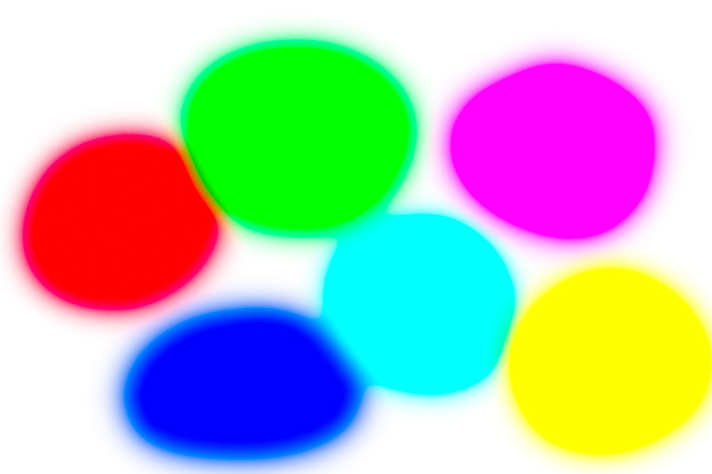
All the images contain 100% saturated colours. That is, the red blobs have (R, G, B) values
(255, 0, 0), the green (0, 255, 0) and so on.
The first row images are in sRGB
colour space, the second Adobe RGB, the third ProPhoto
RGB.
The images on the left have the appropriate embedded profiles, the images on the right have no embedded profiles.
What this should show
On a normal-gamut monitor (not
wide-gamut) then all six images should look the same or similar. This is because normal-gamut monitors have a
colour space that does not extend beyond sRGB (or not
much beyond). If all
six images do not look very similar, colour management isn’t working (or
you are using a monitor with a gamut wider than sRGB). Dodgy (or missing) monitor profile? Browser or viewing program
behaving badly?
First
test – are you using a wide-gamut monitor, and does your browser use both image
and monitor profile?
The left hand images have embedded profiles
On a wide-gamut, colour-managed monitor viewed with a colour-managed
browser or program, the left images should be increasingly
vivid (saturated) as you go down. This
is because each succeeding row of images is in a wider colour space: sRGB, Adobe RGB and finally ProPhoto
RGB. In each image, the colours are
highly saturated, and the Adobe RGB image contains
colours outside the sRGB gamut, and the ProPhoto RGB image contains colours outside Adobe RGB
gamut.
If the second row left image is more
saturated than the first row left image, then you are using a wide-gamut
monitor and the browser respects both image and monitor profiles. Test passed.
On some wide-gamut monitors the gamut is little or no wider than Adobe
RGB, in which case the left ProPhoto RGB image may
look little different from the left Adobe RGB image, but both should look more
saturated than the left sRGB image.
If the left images all look the same, either you
have a normal-gamut monitor or you are using a browser or viewer that doesn’t
colour manage properly (e.g. Edge or IE).
Second
test – does your browser colour manage images with no embedded profiles as sRGB
The right hand images have no embedded profiles, but by W3C
recommendations, browsers should assume that images with no embedded profiles
are sRGB, and colour-manage accordingly.
On a wide-gamut, colour-managed monitor viewed with a colour-manged
browser or program, the three right-hand images should look the same as each
other, and should look the same as the left image in the first row (sRGB). In
this case, the browser passes the test.
They right hand images contain no profiles, so the browser or program
just has to guess. Most don’t bother, and simply don’t colour-mange at all, and the result
is that the colours will look like the bottom left image (that is, more
saturated than the top-left sRGB image with the
embedded profile).
However Vivaldi by default assumes that images without profiles are sRGB, and displays them as such. With Vivaldi, the three right-hand images
should all look like the top left sRGB image with
embedded profile. Firefox can also
assume that images without embedded profiles are sRGB,
but this isn’t the default; it defaults to not
colour-managing such images. If you
change setting gfx.color_management.mode
to 1 (it defaults to 2) then Firefox assumes untagged graphics (with no
embedded profile) are sRGB, like Vivaldi. (To set that option in Firefox, you need to enter “about:config” (without the quotes)
in the URL bar and search for setting gfx.color_management.mode.
Google for how to do it if not sure.)
To my knowledge, neither Safari or Chrome have
any similar option. Vivaldi and Firefox
are still the only PC browsers I know of that colour
manage properly even with untagged images (without embedded profiles). IMHO they are the
best browsers for a wide-gamut monitor.
Edge and IE do not colour-manage anything properly. Both use embedded
profiles (if present) but ignore monitor profiles, rendering images to sRGB (whatever the monitor colour space). Images without embedded profiles are not
colour-managed.
Image
with sRGB fully-saturated
colours (left image with embedded profile, right image with no embedded
profile):

Image
with Adobe RGB fully-saturated colours (left image
with embedded profile, right image with no embedded profile):


Image
with ProPhoto RGB fully-saturated
colours (left image with embedded profile, right image with no embedded
profile):


See also http://cameratico.com/tools/web-browser-color-management-test/
for another good test of browser colour management.
That link also test whether a monitor supports so-called “v4”
profiles. That is, ICC version 4
profiles; the alternative is v2. Version
4 profiles are problematic at the moment. Quite a lot of colour-managed software doesn’t work well with v4 profiles yet. There is very little benefit for v4 profiles
unless all elements of the colour-managed process are using v4 profiles (image
and monitor) and all the software works with v4. The risk is that some may not, but won’t necessarily give any warning message.
I recommend creating only v2 monitor profiles. In software to create monitor profiles (iProfiler, Argyll, ColorNavigator
etc) there is generally somewhere an option to choose
v2 or v4, and v2 is the safest choice.
If there is no setting, then it probably creates v2.